Getting people to your website isn’t the hard part anymore. Between Google, social media, referral links, and paid ads, most Realtors can point to some steady stream of visitors landing on their site every week. The harder question is what happens next. If most of those people leave without giving you a name, an email, or a phone number, the traffic doesn’t mean much.
That’s the real work: figuring out how to convert website visitors into real estate leads once they’re already on your site. It has less to do with driving more clicks and more to do with what a visitor sees, how fast the page loads, and how easy it is to take the next step, not tricking anyone into a form, but removing the friction that makes an interested visitor quietly click away instead.
Below is a practical rundown of what actually moves the needle: page speed, calls to action, forms, chat, your property search tool, trust signals, and what happens the moment someone raises their hand.
Why So Much Traffic Goes Nowhere
Home buyers don’t decide fast. According to the National Association of Realtors’ 2025 Profile of Home Buyers and Sellers, the typical buyer spends about 10 weeks actively searching, and 88 percent buy through a real estate agent or broker. That’s a picture of someone browsing many websites over a couple of months before working with one agent out of all the ones whose sites they passed through.
Your site is competing for a moment of attention, not a lifetime commitment. Most visitors aren’t ready to call you, they’re comparing, checking listings, maybe just curious about their own home’s value. If your site doesn’t give them an easy, low-pressure way to stay connected, they leave the same way they arrived, anonymously, and you have no way to follow up with someone you never captured.
Start With the First Few Seconds
Before a visitor ever reads your bio or looks at a listing, your site has to actually load. Google’s own Core Web Vitals guidance sets specific targets for this: your largest piece of visible content should load within about 2.5 seconds, the page should respond to a tap or click in under 200 milliseconds, and the layout shouldn’t jump around while it loads. Miss those, and you risk losing people before they see anything worth converting on, not just a search ranking penalty.
Google’s own web performance research is blunt about what slow pages cost: the BBC found it lost an additional 10 percent of users for every extra second its site took to load. Real estate sites are especially exposed here, since they’re often loaded down with high-resolution photos, map widgets, and third-party IDX plugins that were never built with speed in mind.
A few things worth checking: run your homepage and a listing page through a free speed-testing tool, test on an actual phone rather than a desktop browser, and make sure buttons and form fields are large enough to tap without zooming in.
If you haven’t audited your site for this recently, it’s worth pairing it with a broader look, we’ve covered some of the most common real estate website mistakes that quietly cost agents leads in more detail.
Give Visitors a Clear Next Step
Once a page loads fast and looks right on a phone, does the visitor know what to do next? A lot of real estate sites bury this behind a single “Contact Us” link in the navigation and call that a conversion strategy.
Calls-to-action work better when they’re specific to what the visitor is already looking at. On a listing page, “Schedule a Private Showing” beats a generic “Contact Agent.” On a seller-focused page, “Get Your Free Home Value Estimate” beats “Learn More.” On a blog post, something lower-commitment like “Get New Listings in This Area” matches where that visitor actually is.
Keep one clear primary action per page. A button that stands out visually and doesn’t compete with other equally loud offers on the same screen will get more clicks, not because of a trick, but because there’s less for the visitor to decide.
Build Forms People Actually Finish
Every extra field on a form is a small tax on whether someone finishes it. That doesn’t mean every form should be name-and-email only, but every field should earn its place.
- Ask for the minimum on the first touch. Name, email or phone, and maybe one qualifying question (buying or selling, general area, timeframe). Save deeper questions for later.
- Use the right input types on mobile. A phone field that pulls up the number pad, and an email field with the @ symbol handy, removes friction for visitors typing on a touchscreen. A three-step form that feels quick often outperforms one long form that looks intimidating, even asking the same questions.
- Say something honest near the submit button. A short line like “We’ll only use this to answer your question, no spam” sets expectations. Regulators including the FTC have noted that transparency about how contact information will be used is part of earning consumer trust.
Test your own forms on a phone every so often, autofill and confirmation screens break in small ways that are easy to miss until you try to submit one yourself.
Make Chat Part of the Page, Not an Afterthought
A chat widget in the corner of your site gives hesitant visitors a lower-pressure option than a phone call or a full contact form. Some people don’t want to commit to an email exchange over a question like “does this house have a garage”, they just want a quick answer.
Whether you staff it yourself, use an answering service, or run an AI-assisted chatbot, the mechanics on the page matter more than the technology behind it. A chat bubble that’s easy to find, opens with a specific question instead of a generic “How can we help?”, and doesn’t pop up so aggressively it feels pushy will get used more often. How quickly you respond once a chat starts is its own topic, the point here is simply making the option easy to find.
Get More Out of Your Property Search
If your site has an IDX property search, it’s probably the single most-used feature, and one of the biggest missed opportunities for lead capture. Most visitors will browse listings anonymously for as long as you let them, which makes sense; nobody wants to create an account just to look at a few houses.
The better approach is to let people browse freely, then offer something genuinely useful in exchange for contact information. “Get an email when a home like this hits the market” through a saved search is a real offer, not a paywall in disguise, and so is letting someone favorite listings and asking for an email to keep that list when they return. It’s reasonable to require an email for a specific saved filter or alert; it’s not reasonable to require one just to see listing photos. Forcing a login before a single result loads just sends visitors to Zillow instead, where they can browse with no barrier at all.
Add Trust Signals That Reduce Hesitation
By the time someone is considering filling out a form on your site, they’ve usually already decided you seem legitimate, or they’ve decided you don’t, and they’ve left. A few things build that trust quickly: a real photo of you rather than a stock image, your license number and brokerage clearly listed, clean and professional listing photography, and a working privacy policy link. It’s also worth making sure your site works for visitors using screen readers or keyboard navigation, the Department of Justice’s ADA guidance is explicit that accessibility requirements for public-facing websites apply to private businesses, not just government agencies.
None of this needs to be elaborate. A short, honest “About” section and clear contact information do more for trust than any badge.
Don’t Let a Captured Lead Go Cold
Everything above is aimed at getting someone to raise their hand. What happens in the minutes after that matters just as much. A form submission should trigger something immediately, an automatic confirmation email or text, at minimum, so the person knows their inquiry went somewhere instead of into a void.
This is where a connected system pays off. When your website, contact forms, and booking calendar work together instead of as separate pieces bolted onto a WordPress site, a new lead can move straight from “filled out a form” to “has a showing on the calendar” without you manually chasing details. If that handoff feels like the most duct-taped part of your setup, it’s usually the highest-leverage thing to fix,” whether that’s automated appointment scheduling tied to your forms, or a broader look at how your site and follow-up tools work together, which is what we build through our website and lead follow-up services.
The Bottom Line
You can’t control every visitor’s decision, and no honest system can promise a fixed number of leads from a given amount of traffic. What you can control is whether your site makes it easy or hard to take the next step, and that’s worth getting right.
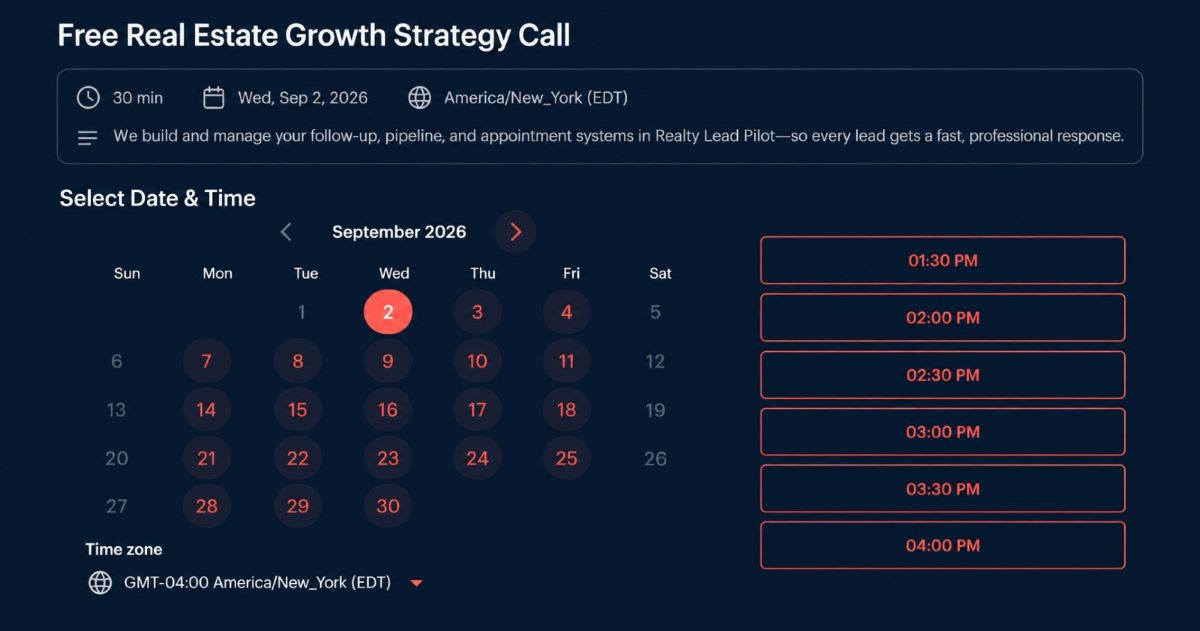
If you’d rather have someone look at your specific site and tell you where the leaks actually are, book a free consultation and we’ll walk through it together.